


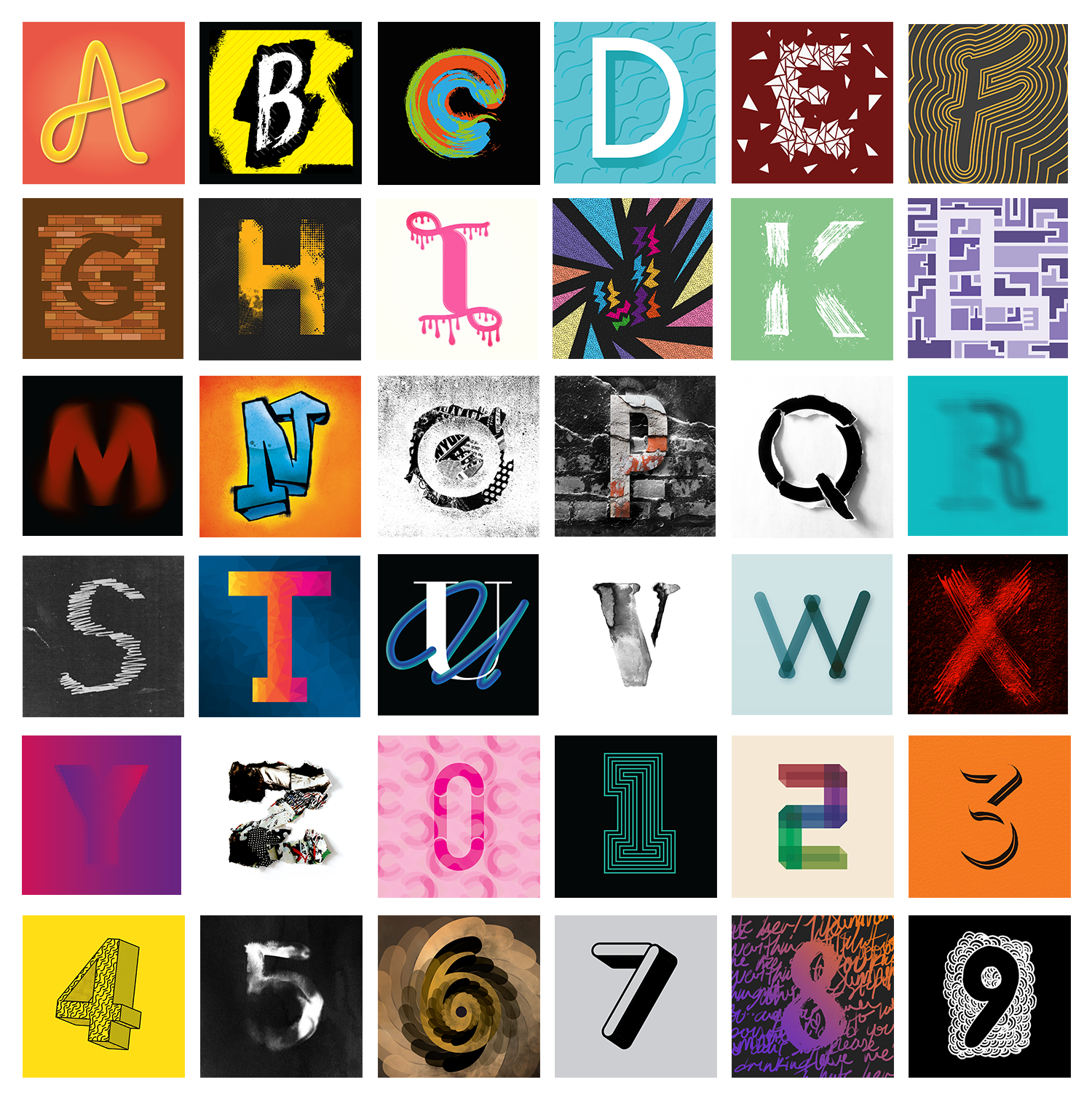
While at college, studying Graphic Design, one of my projects was called 36 Days of Type, which I had never heard of before, but after looking at their website and what the project entailed, I was really excited. As it was part of a college project, I had to choose a theme to create my letters in, and I chose the Urban theme from the list.
After choosing my theme, I didn't really know what I could do with it, so I just opened Illustrator and started playing around with some ideas. I had recently watched a tutorial video on YouTube by this designer called Ste Bradbury, where he created letters using paths and strokes, and I wanted to try it in my free time, but I thought I might as well try it at college and use it as part of this project. After completing the first letter, even though I struggled coming up with a few ideas, I found it so fun creating all the letters and numbers, and I am quite proud of myself for completing the whole challenge.
Out of all the designs, I think my favourites are; a, h, i, k, o, p, q, s, v, y, z, 2, 3, 4, 5 and 7. Each day, I had to post my designs to Instagram, and I was lucky enough to get quite a few of mine liked by the organisers of the project, but unfortunately, I never got any posted to their Instagram account, but for me, the likes were enough. It is such a great project and brings so many artists and designers around the world together.
Thank you for reading this project, and if you liked it please like it, and feedback is always welcome.