

I was tasked with redesigning the KMPT staff app following a change to how our staff can download it. I had previously designed the staff app back in 2018, but it was a very basic system and didn't allow for much creativity.
This time round, we had creative control of the app, so we decided to redesign the entire app, choosing square icons rather than circular as well as choosing different colours to promote different areas (light blue for general trust systems, dark blue for workforce/hr and green for health and wellbeing). We were also allowed to edit the headers this time, so I created the illustration as seen below featuring the app icons and a mock up of a phone showing the app.
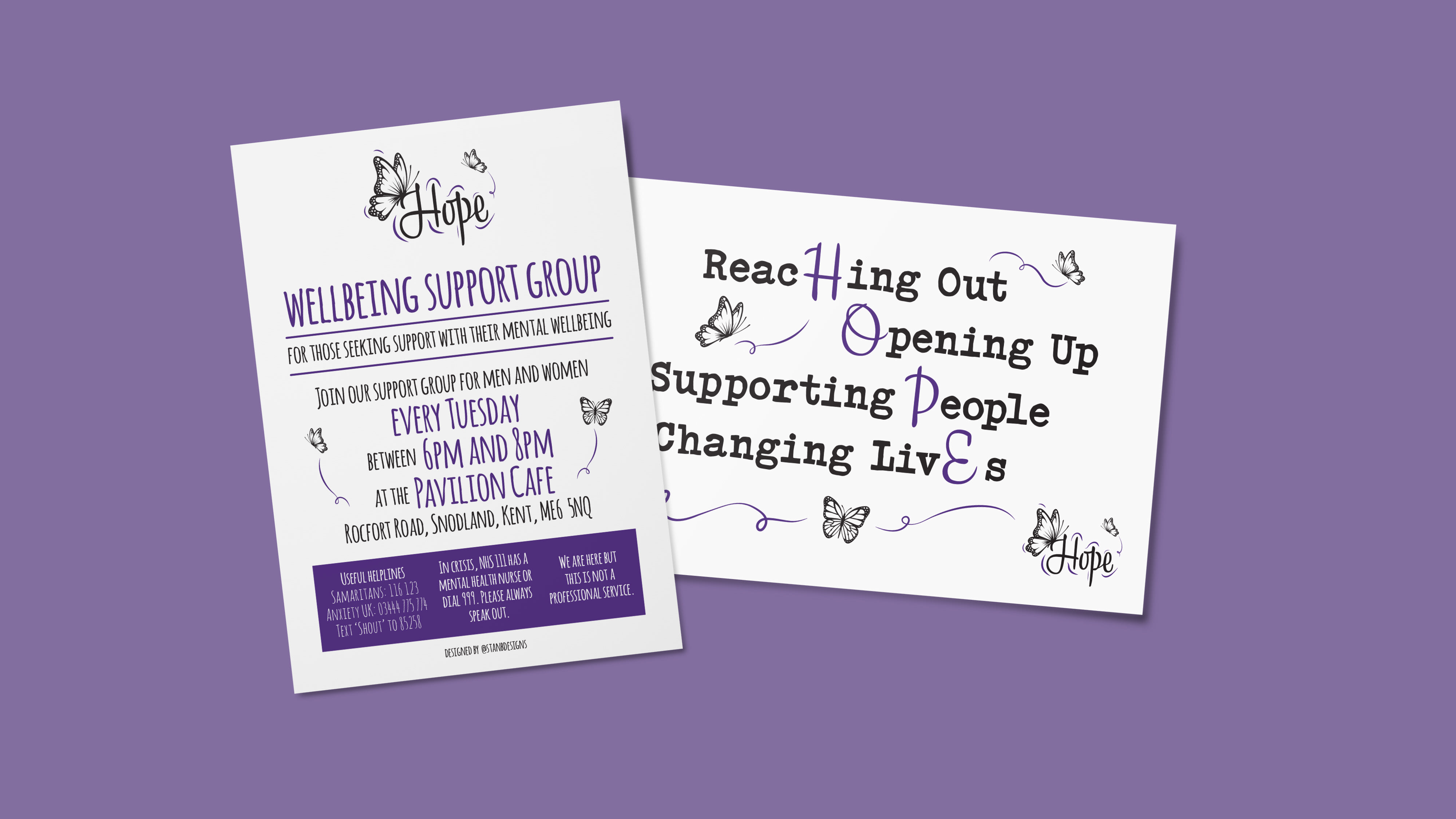
This then also meant we had to design posters to go alongside the app to promote it. This involved using a font that isn't necessarily in the NHS guidelines, but we felt it matched the overall design of the posters and app in general.
I really like the final result.
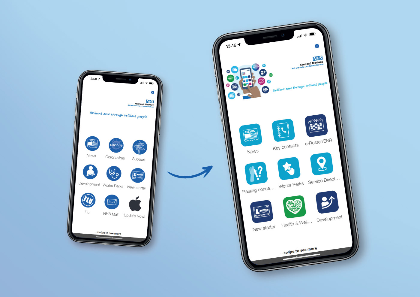
The old app design compared to the newer app design.
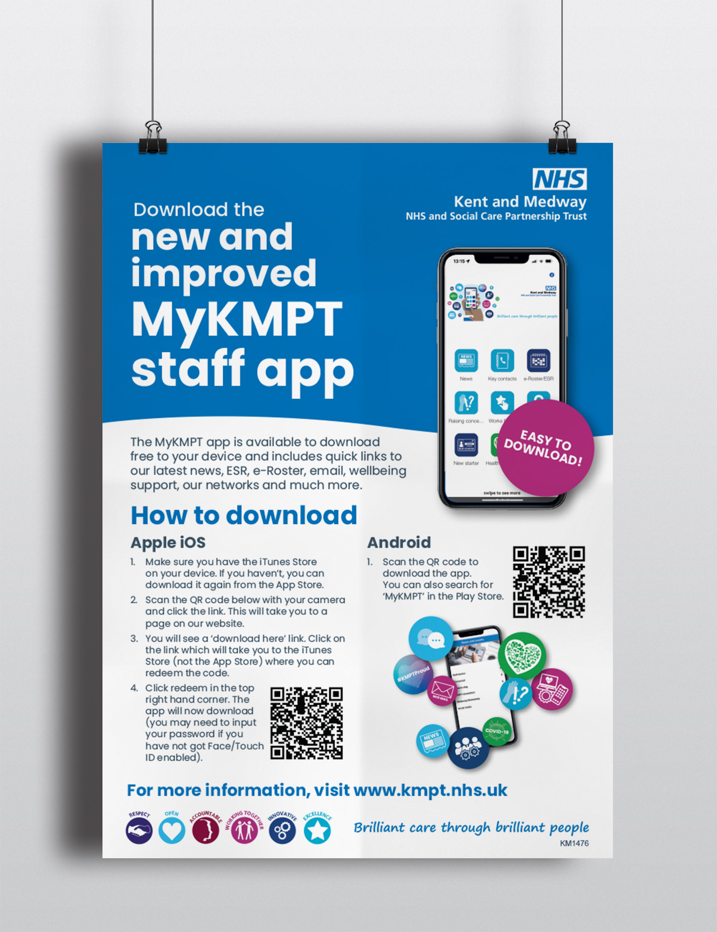
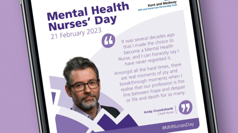
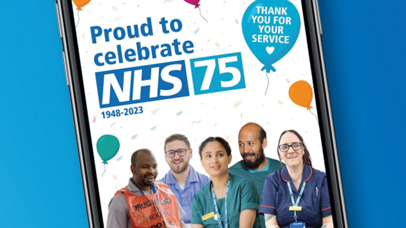
Poster design to promote the app.
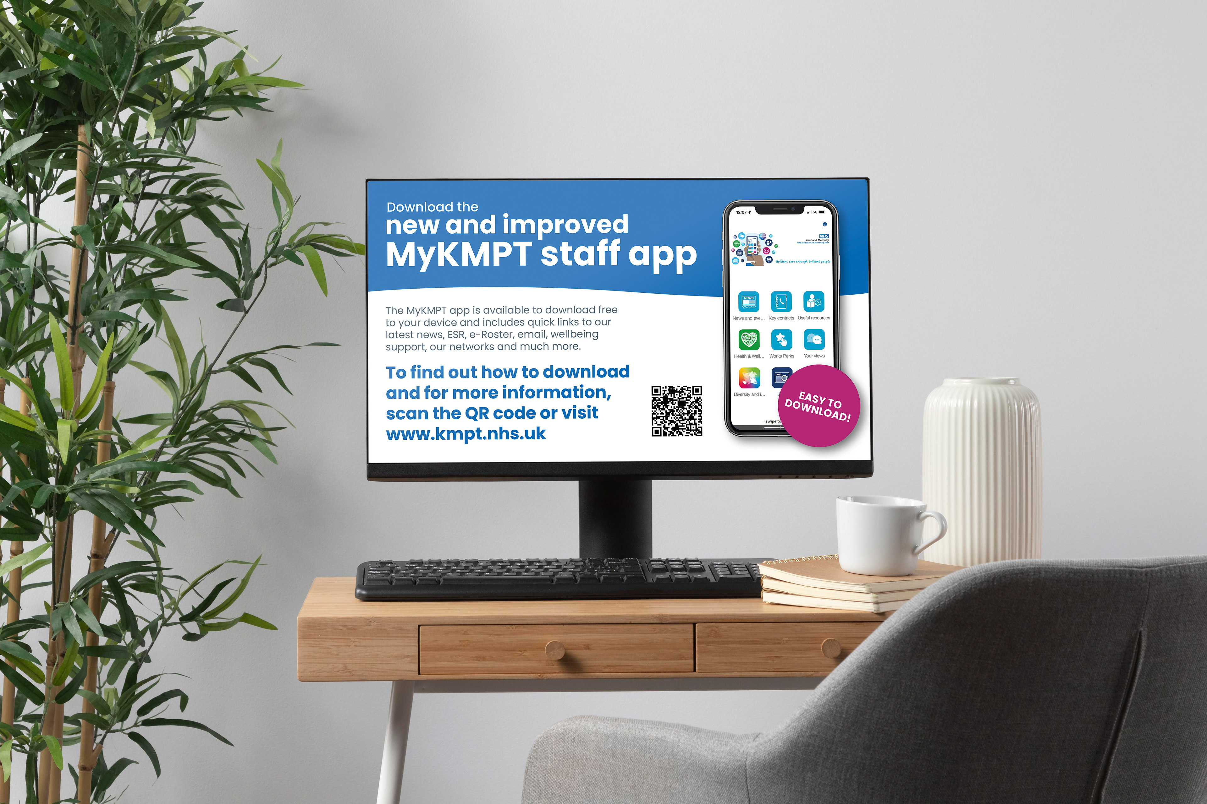
Screensaver design displayed across the trust.